Nice
Does the character's name who this is not supposed to look like perhaps begin with the letter T?
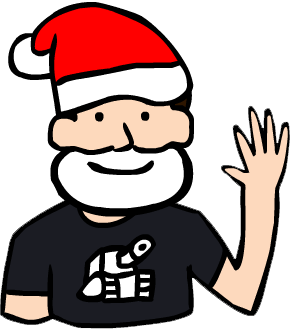
The head and face are well done. The shoulders may be a bit too broad, but preference definitely plays a role in that area. Also, at the angle he is standing, I believe his right arm would be in front of his torso.
The eyes seem to be shaded well. :)


