Absolutely liking the small plot and characters here!!! Really cool stuff honestly!

Glacialbound EP. 1 - Winter Lane
ShareGlacialbound Episode 1 - Winter Lane
Vertical Webtoon Ver. || Vertical Tapas Ver.
Glacialbound Summary:
Within a snow-covered land of ice lies the final home of man. Mirren and Miruna are struggling Hunters who fight monsters to stay afloat. But when given an offer they simply could not refuse, is everything really as it seems?
I counted the big boom page (after 12) as 2 pages since it's double the width of the usual page canvas I was using. Hope this is okay!
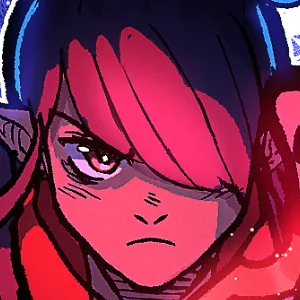
I already love this a lot. Stunning colors and character design with a pretty straight-forward introduction is amazing for a first episode, it's great and you shoul be proud of you!
PEAK FICTION IS HERE
I don't see dead or alive on the poster so why are they not paid?
1. The monster they were hunting transformed into a different creature entirely.
2. If you eviscerated a living being—reduced to alchemy dust and all— there’s no feasible way to say that you dealt with it. Thus, they never got paid
This is a fun entry! In the 16 pages you have, the first couple of pages feel like there is already some mystery just hidden in plain sight, the fact that the bounty board is called the Lazarus board, that name hidden on the second page, and what happened to all those hunters!?
So far, the dynamic of these two is nice and the colors really pop! I also love the design of that merged Gorbo monster. Of the few critiques I have, I think you should use some wider shots, and establishing shots that show us the grandeur of the settings. The only other critique I have is how cluttered a lot of your pages feel, from the SFX, speech bubbles and overall detail lead to a lot of visual clutter with no place for my eyes to rest.
Though it can't be said enough that despite some things to tweak, readability and charm are very much present in your comic, and look forward to more!
I’m glad you enjoyed it! Readability being good is especially nice to know.
I see what you mean with the sfx for sure. This type of critique/feedback is exactly what I like to see, so I’ll definitely work on it going forward!
Licensing Terms
You may not use this work for any purposes.


