00:00
00:00
Newgrounds Background Image Theme

AntonM just joined the crew!

We need you on the team, too.

Support Newgrounds and get tons of perks for just $2.99!

Create a Free Account and then..

Become a Supporter!

think you can make this better?

775 Views | 7 Replies
New Topic Respond to this Topic

think you can make this better? 2011-01-25 04:59:36


I have layed down the base for A-Bot. Here's the drawing I'm using this image to be the background for my track list for my weekly/monthly podcast on Radiogrounds. If you want to hear what that sounds like check it out here.

Every time I do a new podcast I would like a fresh picture for my tracklist, so any kind of alteration, addition, or what ever the fuck else you want to do to this picture, would be sweet. I would re-use this picture, but with a different background, or pose, or w/e. If you want to collaborate further you can direct message me or just post here I don't care.

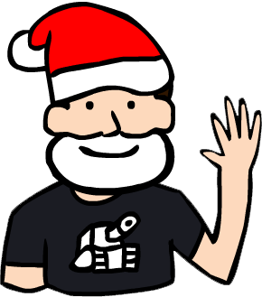
hurp

BBS Signature

Response to think you can make this better? 2011-01-25 05:07:36


At 1/25/11 04:59 AM, swaenK wrote: Here's the drawing I'm using this image to be the background for my track list for my weekly/monthly podcast on Radiogrounds.

Hey that looks alright.
Is it ok if you upload a small version to this thread? We're very visual people, and would like to see a preview rather than click a link. Plus it's an art forum recommendation and stuff.


BBS Signature

Response to think you can make this better? 2011-01-25 05:13:06


At 1/25/11 05:07 AM, TurkeyOnAStick wrote: Is it ok if you upload a small version to this thread? We're very visual people, and would like to see a preview rather than click a link. Plus it's an art forum recommendation and stuff.

I s'pose.

think you can make this better?


hurp

BBS Signature

Response to think you can make this better? 2011-01-25 08:38:55


What's with the shading?
There's no consistency.

Response to think you can make this better? 2011-01-25 16:14:06


:think you can make this better?

I'spose, too =D But I think you did pretty good for having to work with a head-on perspective.


| Art n' animation Tumblr | R&S comic Tumblr | Follow for LIVE streams Twitter | Animation CH YouTube |

Response to think you can make this better? 2011-01-25 16:22:17


that looks awesome a trick for shading is picking the spot where lights coming from its very useful and you forgout the A he has at the bottum middle of his screen as shown when you go to the audio portal

Response to think you can make this better? 2011-01-25 17:52:17


At 1/25/11 04:22 PM, binkyboy wrote: that looks awesome a trick for shading is picking the spot where lights coming from its very useful and you forgout the A he has at the bottum middle of his screen as shown when you go to the audio portal

yeah it didn't fit because of the track list I had to fit in his body. I am trying to think of a way to sneak it in.


hurp

BBS Signature

Response to think you can make this better? 2011-02-04 21:15:18


if you want to give him a mustache, add the (A), add a colorful background, change the color, give him a top hat, I don't really care, I just want a new image for every podcast.


hurp

BBS Signature